
After all the waiting, Google’s Mobile Algorithm update is finally here. Coined as #Mobilegeddon we’ll now start to see sites that are ‘mobile friendly’ gain improved visibility in searches performed on a mobile device.
Jumping on the bandwagon, and in true apocalyptic style, here’s our guide to survive Mobilegeddon:
1. Don’t Panic! – Try and ignore the usual propaganda surrounding the end of the world – or in our case Google’s latest algorithm update – and remember a couple of key points to put your survival chances in perspective.
- The roll out will be over the next few weeks – so there’s still time to prepare and set that new site live.
- It only affects Mobile traffic – Your tablet and desktop rankings are safe….. for now.
- The algorithm is real time – as soon as your site becomes ‘mobile friendly’ you can sleep easy knowing your rankings will return or improve.
2. Allies – You’re going to need to protect your business and mobile revenue from the recent update, so having a team to rely on is vital. You don’t need excess baggage in a survival situation so be selective:

- Data Analysis & Strategist – Before you invest in a shiny new responsive site, let data drive the decisions. Use your digital team to tell you which devices are bringing the most traffic to your site and how much you’d benefit from your investment.
- Web Developer – Responsive websites are recommended by Google as the preferred solution so you’ll need a team of highly skilled developers and designers to execute any upgrade or re-build successfully. Check out Google’s developer guide.
3. Food & Sustainability – Once you’ve survived the initial wave of destruction you’ll want to ensure you have a scalable resource that will cover off any further updates to follow:
- Avoid a mobile version – As mentioned above, Google recommend a responsive website that adapts to the users device. A Mobile site can cause content issues as well as creating additional development and administration time to keep both up to date.
- Design mobile first – Google’s message throughout 2014 was Mobile first, so design and wireframe your mobile site and follow up with tablet and desktop. This will ensure the best practice for the mobile version and won’t end up as a quick fix that needs adjusting when Google updates it’s algorithm in the future.
4. Aid Kit & Tools – If you’re not sure about what to do next, the best thing to do is use the tools and guides available to help direct your decisions:
- Check your site is mobile friendly using Google’s tool – https://www.google.co.uk/webmasters/tools/mobile-friendly/
- Use your mobile to check for the ‘mobile friendly’ tag – Just search your businesses name and review the result.
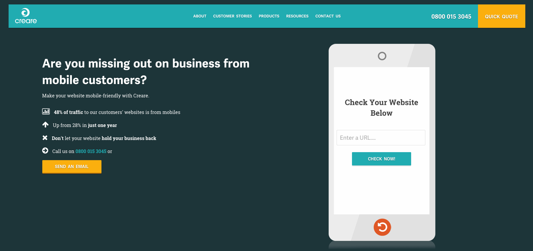
- You can check for mobile friendliness using Creare’s mobile checker tool.
- Read more details about changes:
- http://www.theguardian.com/technology/2015/apr/20/google-mobilegeddon-will-shake-up-mobile-search-results
- http://news.sky.com/story/1468513/google-search-change-could-cause-mobilegeddon
- http://www.creare.co.uk/google-announce-big-changes-mobile-search
- http://googlewebmastercentral-fr.blogspot.co.uk/2015/04/questions-frequentes-compatibilite-mobile.html
Keep and eye out for more from Creare regarding the update in the coming days and weeks, at least that is until the lines of communication go down.