
We’ve been waiting a long time for an up-to-date responsive Magento theme to come as standard with Magento CE and now that time has finally arrived.
My colleague Adam has already written an article on how to develop new Magento themes using the RWD package so if you want the in’s and out’s of how to start coding up your new theme using Sass I’d recommend following that link.
The following post is simply a collection of new theme elements that have appeared within the new RWD (responsive web design) package. I’ve installed the brand new sample data – “Madison Island” – (no more ottoman :/) within a localhost version of Magento 1.9.0.1 for this exercise.
The main areas we are covering are:
- It’s Responsive!
- New Header/Menu Structure
- Is that a slider?
- Product Listing Page
- Product View Page
- Cart Page
- Checkout
Responsive-ness
As already stated, this new theme is responsive. It has been designed to show the most appropriate data to the customer across multiple devices and screen sizes.
To provide this experience, the new theme uses media query break-points in order to change the styles of some elements on the page – allowing them to slot together and re-order themselves to squeeze into/expand out to the limits of different-size containers.
Media Queries
Within the new RWD package there are a number of Media Queries being used. From a casual glance through both stylesheets (styles and madisonisland) we can see at least 5 common breakpoints (taken from skin/frontend/rwd/default/scss/_var.scss):
- $bp-xsmall: 479px;
- $bp-small: 599px;
- $bp-medium: 770px;
- $bp-large: 979px;
- $bp-xlarge: 1199px;
There are also a number of other breakpoints used within the main ‘styles’ stylesheet – leading toward the opinion that certain breakpoints were introduced in order to repair the layout when the screen-size caused the layout to break – rather than designing the website to common screen-sizes (more info on that here).
Within ‘styles’ there is also a media query to handle retina-enabled devices where the pixel ratio is double that of a typical non-retina screen. This allows larger images to be provided in order to maintain super-sharp edges.
New Header/Menu Structure
The new theme design has dramatically re-structured the head area – particularly the Account, Cart and Main Navigation elements.
Account menu
The account menu has been condensed into a drop-down box that only appears once the customer clicks on the Account link. This then provides the user with the majority of their “my account” actions- rather than having to display each individually.
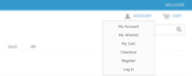
This is achieved through using custom jQuery that you can find (along with lots of other handy functions) within skin/frontend/rwd/default/js/app.js.
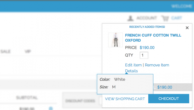
Cart Menu
The cart menu has also been condensed into a pull-down tab with new functionality to allow the adjustment of quantities – this is actually a really nice feature that we’d recommend using in your own custom themes. You can even adjust quantities through this section.
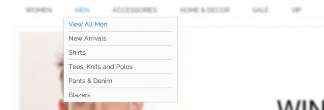
Main Navigation
The main navigation has had a bit of a facelift in this new theme. Using a different type of drop-down menu plugin and some new styles it certainly looks more up to date than the old menu. Notice the new menu item at the top of each sub-menu “View All X” – just another link to take you to the parent category.
Mobile Appearance
On a mobile the header section is compressed into 4 separate tabs, by click on each heading the appropriate content is displayed directly below.
Homepage Slider
The new RWD theme comes complete with a jQuery slider – using jQuery cycle. You can find the code where the slider is initialized within skin>frontend>rwd>default>js>slideshow.js and it looks like this:
$j(document).ready(function () {

    // ==============================================
    // UI Pattern - Slideshow
    // ==============================================

    $j('.slideshow-container .slideshow')
        .cycle({
            slides: '> li',
            pager: '.slideshow-pager',
            pagerTemplate: '<span class="pager-box"></span>',
            speed: 600,
            pauseOnHover: true,
            swipe: true,
            prev: '.slideshow-prev',
            next: '.slideshow-next',
            fx: 'scrollHorz'
        });
});
From the looks of it – as long as you have this javascript file included on each of your pages you should simply be able to add an HTML list element with images and a slider should magically appear (taken from the theme):
<div class="slideshow-container">
<ul class="slideshow">
<li><a href="linkhere"><img src="imagehere" alt="" /></a></li>
<li><a href="linkhere"><img src="imagehere" alt="" /></a></li>
</ul>
<div class="slideshow-pager"> </div>
<span class="slideshow-prev"> </span> <span class="slideshow-next"> </span></div>
Obviously as this is a responsive theme you will find that the slider itself shrinks down to match the screen-size.
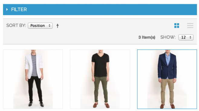
Category Product Listings
The product list view has had a bit of a makeover – especially the product filters and grid.
Filters & Grid
Filters are now clearer and feel easier to navigate. They also respond nicely down to mobile – where they collapse themselves and appear just above the product grid in order to make the page easier to navigate on smaller screen sizes.
The grid hasn’t been drastically changed but there are a couple of nice icons now for switching between grid/list views.
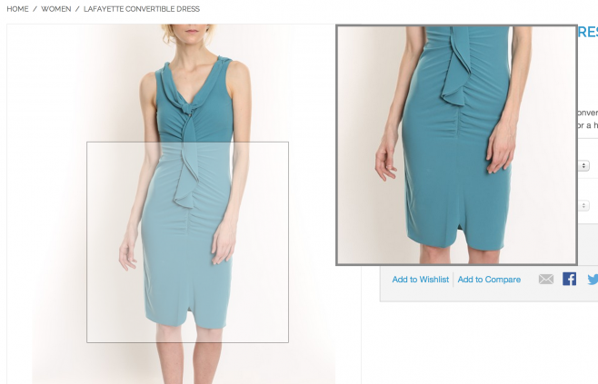
Product View Page
The actual ‘product view’ page has undergone quite a few changes in this new theme – most notable image zoom, product reviews and social links.
Image Zoom
The default image-zoom feature is very similar to some paid extensions that are available. There have always been ways and means to incorporate open-source jquery image zoom plugins into Magento but now this has been integrated as standard.
Another great feature that has desperately required updating has been the product gallery images. Typically you’d need to click on each product image to bring a pop-up full-size version of the thumbnail. Now though, the new media gallery will swap out the featured image and activate the product zoom feature on this swapped image. Very handy!
Social Icons
Not the most exciting implementation of social links I have ever seen but the idea is there. It would be much better if these simple click+share buttons were transformed into smaller pop-up windows with pre-configured wording for the user to share (such as hashtags etc). As it is, we can only share the product name and link.
Product Reviews
Another really useful change here is the inclusion of the actual product reviews on the product page itself. In the past we used to see the review text only available on a separate page – this is vital content that could be used to help improve the SEO of our actual product page.
The new RWD theme allows us to view the reviews within a tab at the bottom of the page. The only problem however is that the review page for this product still exists – and therefore the review exists in two places. If we were to go ahead and implement on-page reviews like this we should ensure that our robots.txt file is disallowing our /review/product pages.
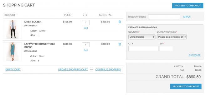
Shopping Cart Page
The shopping cart has been condensed in order to provide more information to the customer. With a 2-column layout as standard the customer can now see their shopping basket at the same time as their order totals – rather than having to scroll down to see the totals information. Such a small tweak but you’d be surprised how much of an impact this can make.
There are also a few little touches with regards to the cart update boxes – in order to keep things condensed the update button only appears when clicking on the qty box for any given item.
Conclusion
Essentially we have a new theme here, one that is responsive and incorporates quite a few changes that will come as a welcome reprieve for many designers.
Depending on how much we wish to transfer to our own bespoke theme we could possible save hours of development time in just performing the small tweaks that this theme seems to do so well.
Let me know your own thoughts on this theme or even show how you have adapted the RWD theme to make it even better.