
We love making tools at Creare, and our latest creation is a nifty bit of kit to allow you to check whether a website is mobile-friendly. You can test your own website here.
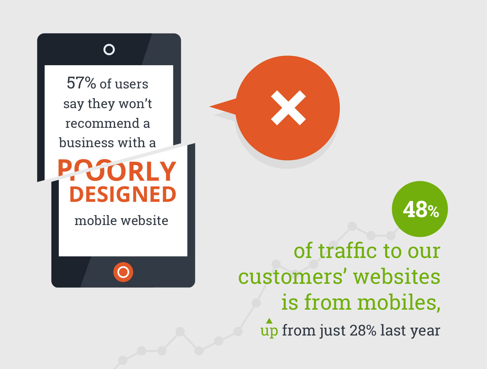
With 77% of the UK population owning a smartphone, it’s increasingly important to have a website which works just as well on mobiles as it does on a desktop.
We’ve seen this first hand at Creare, with 48% of all traffic to our clients’ websites coming from mobiles – as covered by James in his latest blog post.
Take our tool for a spin to see if your own website looks good on mobiles and remember to let us know in the comments below what you think of our latest bit of kit!
For those web designers who are interested, we are looking for the viewport meta tag to specifically isolate responsive web design – Google’s preferred method of mobile-friendly web design.