
Forms. Nobody likes filling them out. Forms take time and effort, plus, we often find ourselves typing the same details over and over again. Name. Email Address. Phone Number. Address. Favourite Colour…
However, forms do exist, and they exist for a reason; to help us get information, products or services that we need. So, as a provider of those services, how do you design and create forms that actually convert?
Take a moment to read through what we believe to be five of the most important considerations to make when you’re aiming to get potential customers to take that leap and click the button to complete your form.
ONE:Â What does your form look like?
Before your customer even processes the information you are actually asking them to give and why, their eyes and brain will have processed an initial assessment of what they are looking at and whether it is worth their time.
Think about AIDA Principles…Â Attention, Interest, Desire & Action
It is therefore important to make the design of your form visually appealing. This will help reduce initial friction that may be felt about bothering to take the next step and fill the form out. But practically, what does this really mean?
- Make the primary call to action large & obvious (think contrast)
- Consider the colours you use and test variations
- Keep it as short as possible
- Stick to one column if you can
- Test whether a pop-up form may gain better conversions
- Use honeypot instead of captcha to reduce spam
TWO: What information do you actually need?
Think carefully about the purpose of your form and what information you really need at this initial stage of contact. For example, do you actually need their full address and postcode if the initial aim is simply to give them a call to discuss their needs? And do you really need to know their gender?
Don’t ask your customer to waste their time filling out information that is not necessary at this stage in their journey with you. You can always request additional information at a later stage once you have convinced them it is a great idea to sign up / create an account / get in touch with you.
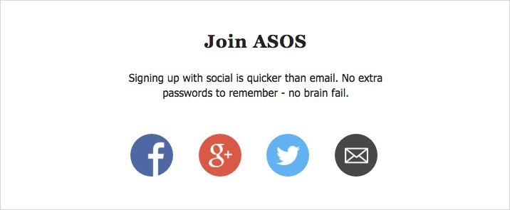
With every additional field you do request to be completed, you are creating an additional barrier to conversion. This will ultimately result in drop-offs in form completion. Don’t forget of course that, if it makes sense, you could utilise social login for sign up or account creation on your website so that maybe you don’t actually need a form in the first place? Radical.
THREE: How does your form function?
Great usability is key.
You know those irritating forms where you fill out all your details and click ‘Send’ only to find that it doesn’t like one or more of the entries you have made but you have no idea why? So, you begrudgingly fill everything out again (as the form helpfully reset and cleared your data) only to find the same thing happens. Then, after smashing your head against the table, you finally realise they needed a space between your postcode (obviously). Or maybe there was a required field that they forgot to tell you was required. Most people won’t stick around to bother working that out, they will be long gone and a potential customer no more. Lesson: Don’t be picky with a specific format that you need data to be entered in or, if you must, then make any error messages obvious and easy to understand. Plus, remember to always mark required fields clearly.
Make the user experience as smooth as possible to reduce friction
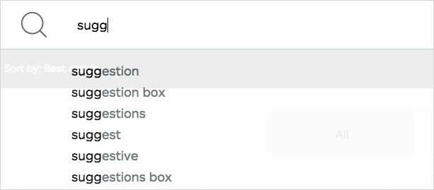
Also consider whether your customer is already logged into your website when you are requesting the form completion – could you auto fill any of their details to save them time? And if you have a field which requires an option to be selected then avoid annoying drop-down menus that have lots of options as they are not user friendly (especially on mobile) and are proven to reduce conversions. Instead, if it is definitely (completely and utterly) necessary to gather that information then try an auto suggest script that gives them an option to click once they start typing a few letters.
FOUR: Why should they bother?
Do your customers want to read a huge spiel of corporate jargon and buzzwords that don’t actually mean anything? My guess is no. Instead, keep your language clear and concise, and choose words and phrases that meet them where they are – answering any potential objections they may have and presenting quality value propositions. If the words or labels you use don’t add value or weight to the form, then remove them.
Make sure you give your potential customers a reason to trust you. They need to feel comfortable disclosing their information to you and to believe there is value and benefit in doing so. Social proof can be a great way to achieve this. For example, showcasing the number of happy customers that you already have or displaying your independently verified customer service levels will strengthen your authenticity.
What is your value proposition? If you don’t have one, then you need an attractive one! Make it clear why your form should be completed. This will of course depend on the aim of your campaign and your target audience, but some ideas to consider are whether you can offer something for free or whether you can solve an issue which they are having. To be successful with this, make sure you talk to your customers to fully understand their buying motives and the problems which they need solving.
FIVE: What happens next?
You’ve nailed the design, functionality and value of your form! Hooray! The fields have been filled out and your potential customer is ready to click… ‘submit’ hmmm so what exactly am I submitting again and do I really want to? It’s really important to make your form call to action button meaningful to elicit the desire to act e.g. ‘Start Your Trial’ or ‘Request Free Report’. This will communicate to your customer exactly what they can expect to happen next, giving them confidence that the value proposition presented to them will be followed through.
However, don’t just launch your form and assume you’re done. As with any conversion rate optimisation; test, test and test again! Subtle changes to the wording of your very important form call to action button for example could result in huge improvements in your conversion rates.
Do you want to improve your own form?